Logos & wordmark
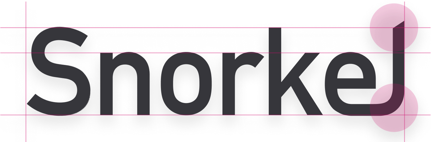
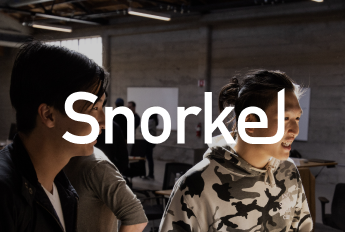
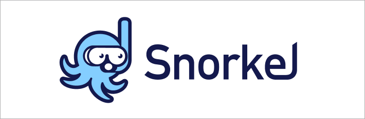
Snorkel Wordmark
The Snorkel wordmark is our primary logo, and should be your go-to for most use cases.
The wordmark is based on a modified version of the DIN typeface, with custom ascenders and ligatures.
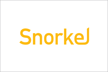
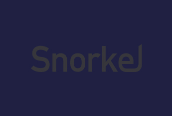
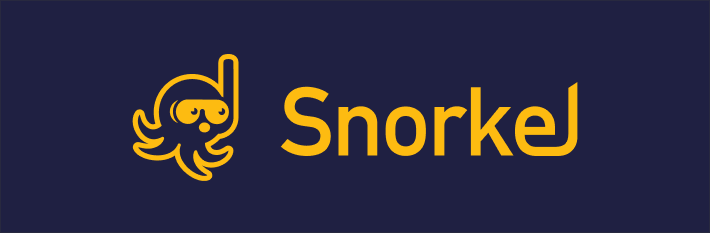
Color variations


Minimum sizing

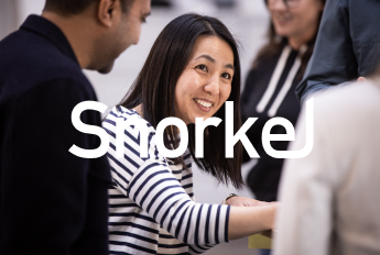
Clearance
Please allow for a minimum space of the x-height (the height of lower case letters) around the wordmark.

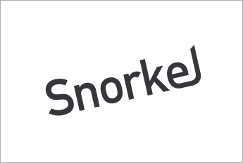
Misuse
In most cases you should follow this one golden rule and you won’t have to worry about irate designers protesting outside your house:
Don’t change the wordmark in any way - no stretching, no effects, don’t change the colors and don’t try to recreate it in any way.
Just for emphasis, here are a few examples of how not to use the wordmark:

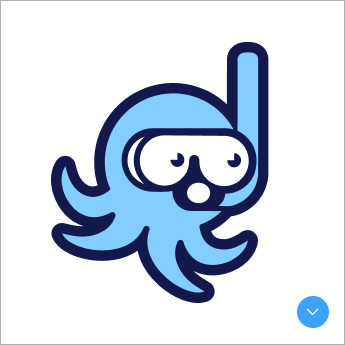
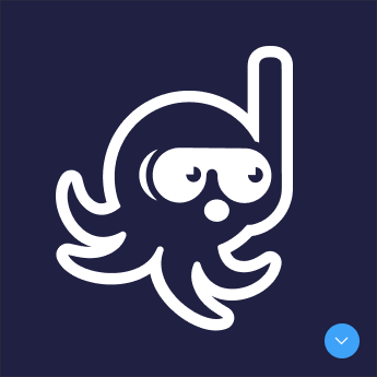
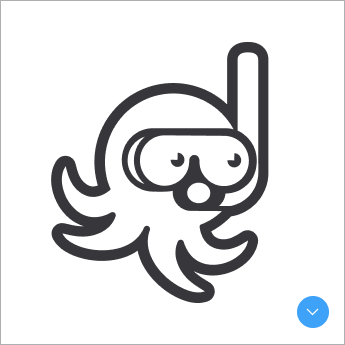
Mascot (Dr. Bubbles)
Meet Dr. Bubbles, our loveable mascot representing the playful side of the Snorkel brand.
While Dr. Bubbles' charm can endear it to audiences, it should only be used in a context where the Snorkel brand is clearly established, never standalone.
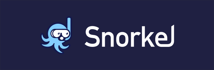
Color variations
Please note:
Unlike the Snorkel wordmark, Dr. Bubbles has key design differences depending on the background they are being used on. Please note that a dark background version cannot ever be recolored to work on a light background (and vice versa) as the designs are different.
Usage
As with our wordmark, in most cases you should follow this one golden rule and you won’t have to worry about irate designers protesting outside your house:
Don’t change the logo in any way - no stretching, no effects, don’t change the colors and don’t try to train an octopus to wear a snorkel (please, they hate that)
Just for emphasis, here are a few examples of how not to use the logo:


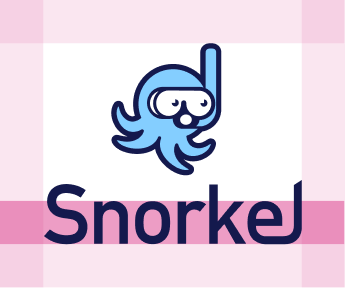
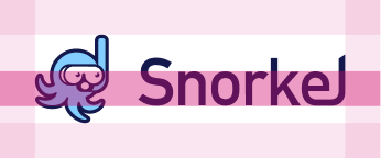
Snorkel Lockups
There are two versions of the Snorkel lockup combining the Dr Bubbles mascot with the Snorkel wordmark - a horizontal and a vertical layout.
The lockups should only be used on those occasions where the wordmark on its own might be a little sterile or you want to show off Dr. Bubbles - a conference stand graphic or swag would be good use cases.
Color variations
Please ensure that the logo always has enough contrast to stand out, and avoid placing it on patterned or detailed background imagery.
Please note:
As shown above, the Dr. Bubbles part of the lockup has key design differences depending on the background they are being used on.
Please note that a dark background version cannot ever be recolored to work on a light background (and vice versa) as the designs are different.


Minimum sizing

Clearance
As with our wordmark, our lockup needs room to breathe and should not be crowded out by other content. This is particularly important when used with other logos.
Please allow for a minimum space of the x-height (the height of lower case letters) around the outer edges of the lockup.

Misuse
In most cases you should follow this one golden rule and you won’t have to worry about angry designers camping outside your house:
Don’t change the lockup in any way - no stretching, no effects, don’t change the colors and don’t do anything weird with it
Just for emphasis, here are a few examples of how not to use the lockup:
Outdated logos
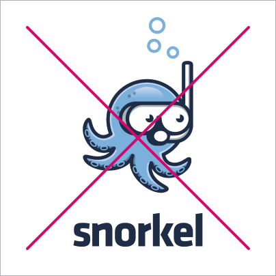
A common issue with Snorkel being mentioned in press releases and even some internal messaging, is that we are seing the outdated ‘Snorkel’ research project logo being used to represent Snorkel AI.
Please help us identify and correct this incorrect usage wherever you see it.
Below are some tips to help identify outdated logos.
Key differences
Here are some key differences to take note of when checking if your logo is up to date:
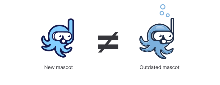
Dr Bubbles
You will notice that the new Dr. Bubbles mascot has less detail - for example there are no bubbles, no shading or suckers on their tentacles. You will also notice that the lines on the new Dr. Bubbles are thicker and use more vibrant colors.
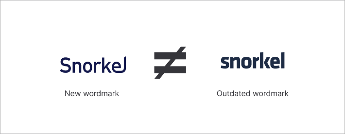
Wordmark
This one is a little harder to recognize, but there are two key differences to look for: The new wordmark uses an upper-case ‘S’ and has a modified ‘el’ ligature - which means they are connected into one shape.
Colors
Typography
Logos
Flow patterns
Icons and illustrations
Templates
Download the latest Google slides and docs templates, social to build branded presentations, documents, and more.