
Typography
Primary font

Secondary font

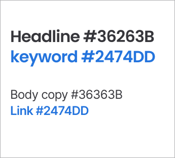
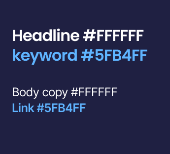
Color usage
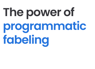
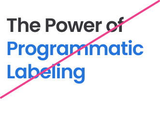
Sentence case
Kerning and leading
Kerning and leading are typographic terms that refer to the spacing between individual letters and spacing between lines of text, and both are integral to ensuring our typography is legible and looks and feels part of the Snorkel brand.
Please refer to the typescale page for detailed documentation for kerning and leading settings within Figma.


Alignment
Alignment is extremely important in typography. Our preferred paragraph layout is left aligned, non-justified type to optimize legibility.
On occasion, centered text can be used where we want to make a bold statement or create a particular aesthetic, to be used sparingly.
We shoudl avoid using right-aligned text and we should never mix alignments in a paragraph.


Typescale
Colors
Typography
Logos
Flow patterns
Icons and illustrations
Templates
Download the latest Google slides and docs templates, social to build branded presentations, documents, and more.